The graphic design for Magic, the Gathering card frames
I have known Magic, the Gathering since I was 13. It was 1996, and I was overwhelmed with a absolutely new concept of a fantasy trading card game. Magic is now in its 25th anniversary, and although there’s been some time since I haven’t played regularly anymore, this game still plays an important role in my life.
To any game designer, Magic is an incredible tool. It’s maybe the world’s most complex game ever made (with almost 20.000 unique cards printed), but they managed to split their development and design to both very enfranchised players and new ones, making the game still interesting for long time fans and accessible to anyone who is trying to become a player.
Also, Mark Rosewater, their head game designer, is someone who really loves the game: Besides leading Magic’s design, he also runs polls everyday on twitter, releases two podcasts every week, writes an official article every week and answers lots of questions on any free time he has. And as someone that also loves the game, I think he is really trying to make Magic a better game for everyone.
But as a graphic designer, I do think Magic’s visual design is somewhat not keeping up to its game design goals. But before I start explaining what I think, I would like to clarify that all the critiques are not directed to the designers, or the design itself, but to the bigger concept. I do not want to judge whether I like a card frame or not. I am questioning if they are fulfilling the right role.
New world order
In one of his articles, Mark Rosewater introduced us to the “New World Order” in their design process: They would make sure that the common cards — as they are the cards that new players will have the most contact with — will never be overly complex: They should be easy to understand and easy to play with, so as these players become more interested and start buying more packs, they will gradually start having contact with rarer, and more complex cards, making the learning curve less steep.
This is an awesome move for such a complex game. But the game complexity is not only in the card text and rules. Even before anyone plays a Magic game, they will see Magic cards. And that’s where the problem lies today.
Today, almost every new set (a collection of new cards, released every trimester) brings some novelty to the card frame. To someone that has never played the game, watching from outside can be very frustrating, because there are so many visual things to keep track of.

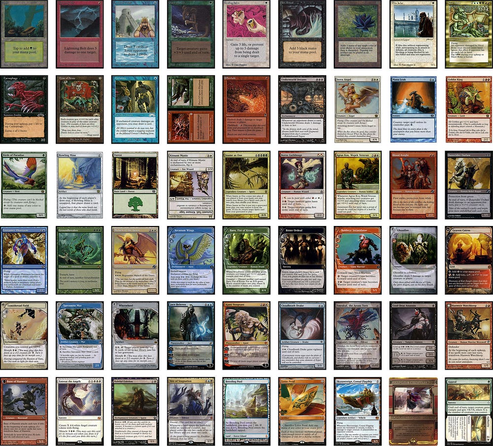
This hand of cards above is possible to be played in a single game of Magic. New players will almost never have to play something like this in their first games, as many of those are very rare or older cards. But before someone plays this game, they will usually watch someone play. And it can look more complicated than it it really is (and it is somewhat complicated) because some cards are designed to be good looking, to be a mechanical marker, to convey information, but not to deal with Magic’s biggest problem: its complexity.
Also, this high variance is making the game lose its identity. I can propose a quick game to show this point — I will add a Lord of The Rings card on that same hand above. I will add it again to another 7 cards that use the “normal” card frame. Show these 16 cards to some people who have never played the game, and see how fast they can spot the intruder in both cases:


The first row lacks consistency, and this is key to any design product.
To make things more complicated, not all changes are permanent additions to the game’s ever-changing “Standard format” — Magic tournaments usually uses only the last two years worth of cards— which means that people that saw a game once, may experience another very different set of cards and frames when they come across it again some years afterwards.
But Magic is a collectible card game. This also means that (almost) any card ever printed is available to be played in casual games and in what they call “Eternal tournaments”.
So, these continuous and incremental frame design changes are all slowly adding up to the cognitive load that Magic needs to be understandable. Some of those changes are more impactful than others. And to help illustrate these point, I arranged them into three groups, from least to most harmful to the overall understanding of the game.
Before I explain what those groups are, let me show, for those who never played Magic before, how its card layout usually looks like:
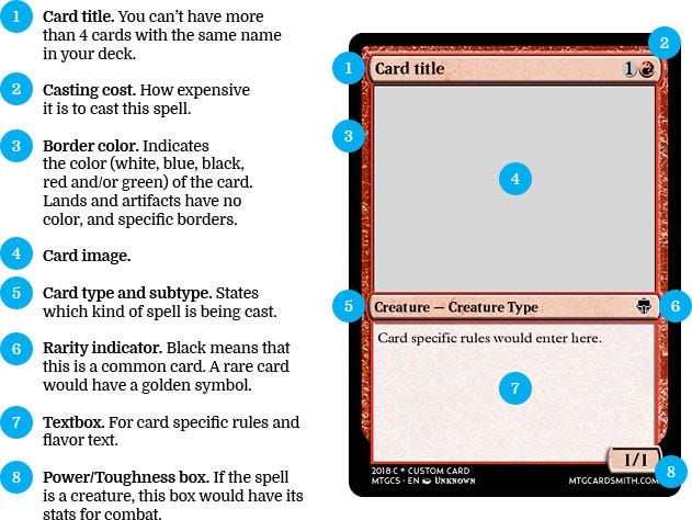
If I were to teach Magic to a new player, that is the essencial information I would make sure they had understood. But there are many exceptions to these rules.
I. Little details, little impact (or a great one).
As I said earlier, there are 4 major set releases each year. Let’s say that each set has 1,5 new game design mechanic in average, adding up to 6 new rules each year. This year is the game’s 25th anniversary so, we’re talking about a game with something around 150(!) mechanics.
To make some of them more distinguishable, the designers sometimes makes some subtle modifications to the card frame. When the change is bound to this impact group, it doesn’t affect the “core” card layout. The impact is minimum, as many times it can be an easily overseen detail, or it can have the best of the outcomes, by making something more visually understandable without messing up basic concepts.

The frames for the “miracle” cards from the “Avacyn Restored” set, that had a special border that “appears as if the art is bathed in light” and the “hybrid” cards from the “Ravnica, City of Guilds” set are examples of different card frames that I would file in this category: The miracle card frame is beautiful, but the card wouldn’t lose much without it. The hybrid card frame helps a lot in understanding that those cards have two different colors.
II. Somewhat familiar but daunting.
When you have such a high number of existing mechanics, I can imagine that coming up with something both new and fun is very hard. Many times these new mechanics won’t work very well with the existing card frame. Sometimes they actually could work, but it wouldn’t look as new and fresh.
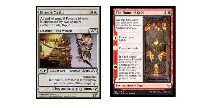
The card frames in this impact group — specially when there are many of them around at the same time — helps to break that core card layout concept, making the game harder to follow. Cards known as the “flip cards” from the “Kamigawa” set were so hard to understand in a first glance, that they would never be used again. The “Saga” mechanic from the upcoming set “Dominaria” seems like a great mechanic, but creates a new visual layout for the card — the text box is over the card type, for example — while it makes it more unique it also adds cognitive noise. The card becomes more complex even before we start reading the rules on it.
III. Totally unique.
The final group are cards that tear down any expectations you could have on how a Magic card would look. Some special cards like the “Amonkhet Invocations” (a special, very rare set of cards released with the Egypt themed expansion), have a totally unique layout.
But this special treatment isn’t privilege of rare cards. In “Unstable”, the basic lands — the most common cards in the game — received a “borderless” treatment, and are very different from anything done before.
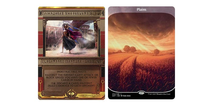
Those cards are usually received as innovations, but each new execution of a temporary brand new layout makes the game less cohesive. They make the game lose its identity for the sake of marketing. If the color pie — the relation between the five colors of Magic — is something game designers should not mess with, the core card layout should be its equivalent for graphic designers: It’s one of the game’s landmark.
Design is about standards.
It seems that the visual design, while creating beautiful and creative frames, is pursuing a different goal from the game design. When it comes to game design for Magic, there are templates for how to write the card rules, there are red flags whenever a common card is getting overly complex, and everything is incredibly standardized when you come to read their rules — they make a point of rewriting all cards on their database whenever a change is made, to make sure everything is on the same ground.
And although there are obvious limitations when this comes to graphic design in physical cards (they can’t just burn and replace every card ever printed any time there’s a visual update), it just doesn’t look like those standards are being cared for.
In the upcoming set Dominaria, for example, they will start using a hairline between the rules and the flavor text, inside the card text box. The argument for it was that besides being a nice touch, it would make rules more distinguishable from flavor. But then, in all the promotional cards of the same set, that hairline is gone.
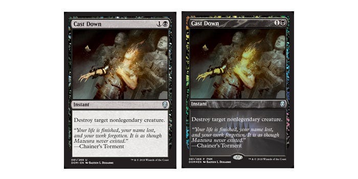
Wasn’t the hairline fulfilling a game purpose? Is it worth removing something that is helping the game be more understandable? Or in the end it wasn’t that helpful, and therefore shouldn’t exist in any form?
I am not against change. But I am for consistent change. I don’t think that the “Future Sight” card frame — A set that they were experimenting with “possible futures” for Magic, the Gathering — was a graphic design mistake. I think using the frame just for that set was.
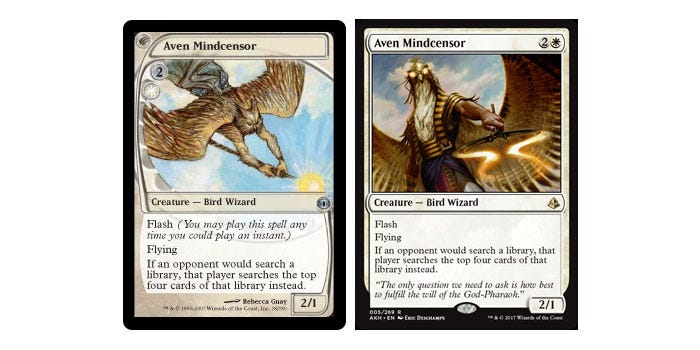
My final advice would be: use the basic frame structure as a constraint (“limitation breeds creativity”, Mark Rosewater says), and — if needed — work from there to create new details that are really meaningful for the game, and be more careful not to create more noise. Design (both visual and game design) should be working together against complexity. If, then, the frame is not helping anymore, change it altogether: Create — and start using — a new frame for the next 25 years. Magic is one of the greatest games ever, it will endure.
One more thing.
As a celebration of Magic’s 25th anniversary, here are all the major frame designs and details that were used in all standard-legal (something as the “professional”) sets, since its beginning:
Limited edition (1993)
The first edition debuted the original 7 frames of Magic: One for each of the five colors, a brown frame for “artifacts”, and a gray-ish one for lands. The land textbox matched the color of the “mana” that it generated.

Arabian Nights (1993)
The first expansion set added the expansion symbol on the right of the card type (In Arabian Nights, it was a scimitar).

Legends (1994)
First appearance of the gold frame, representing multicolored cards.

Exodus (1998)
This was the largest period— 4 years — during which the card frame wasn’t altered. Exodus introduced the rarity indicator, by coloring the expansion symbol black (for common cards), silver (uncommon) and gold (rare).

Apocalypse (2001)
By printing two “mini” cards side by side, Apocalypse created the “split” cards.

Odyssey (2001)
To add a reminder that some cards had effects after its destruction, Odyssey used a tombstone icon before the card title. This was discontinued and never used again afterwards.

8th Edition (2003)
The 8th edition of Magic’s core set, unveiled a new design for all frames. The core layout was still the same, but the all card text got a lot more legible, the artifacts turned gray, and the basic lands depicted only a giant mana symbol on its textbox.

Kamigawa block (2004)
Besides the first appearance of a gold card in the updated frame, Kamigawa block also created the “flip” cards, that would have different rules for each side.

Ravnica block (2005)
Ravnica updated the multicolored cards, by adding the hybrid concept: A card that could be red OR white, for example. The frame would then have both colors. This block also changed the traditional multicolored cards by adding a two-colored hairline around the card title, illustration and textbox. This hairline would only appear in cards that have two colors.

Planar Chaos (2007)
Some cards had an experimental frame treatment to show that they were “timeshifted”: A new version of an old card, but in another (more appropriated) color, following the color pie. This frame was never seen again.

Future Sight (2007)
Future Sight was playing around with possible futures for Magic. One of these futures would have a new frame. This new frame has the mana cost on the left (so they could still be read while fanning all the cards in your hand) and a card type icon on the top-left. Also it was the first time an artifact had a colored frame and the first time a colored spell had a colorless frame. This frame was never used again since then.

Lorwyn (2007)
Introducing the planeswakers for the first time as Magic cards. These wizards were always the most powerful beings in the game lore, but they never had a special treatment inside the game until Lorwyn. They all have a special frame, and are usually sought-after cards.

Shards of Alara (2008)
This block had the first gold planeswalker, and the first time that a colored artifact was used in the standard frame after its introduction in Future Sight. Also, Shards of Alara debuted a new rarity — the “mythical rare” cards — that were represented by an orange expansion symbol.

Rise of the Eldrazi (2010)
The “Eldrazis” were ancient creatures that predated the colors of magic, so they were represented by colorless cards, with transparent frames. To fight them, some creatures could “level up”, and enhance their stats during the game. This leveling up was depicted by a fragmented textbox, and multiple power/toughness boxes, one for each level.
The “level up” frame never was used again outside this set.

Innistrad (2011)
As a Gothic-Horror set, Innistrad had lots of werewolves, that were represented by double-faced cards: Cards printed on both sides. The front side had a “sun” symbol before the card title and a subtle indicator on top of the power/toughness box, while the backside had a frame somewhat similar to the “timeshifted” ones, with a “moon” symbol before its card title and a color indicator before its card type.

Avacyn Restored (2012)
Avacyn Restored, introduced the “Miracle” frames which never were used again after this set.

Theros block (2013)
Theros was a Greek inspired world, and the connection to the gods was represented by a starred background on the border of some cards. This treatment also never got a second chance.

Magic Origins (2015)
The second (and current) overall frame change was unveiled in Magic Origins. It was a more subtle change, adding some more (non-game related) information on the bottom of the card, which received a black colored background. Also, rare and mythic rare cards received a hologram sticker to prevent forgeries.
Magic Origins also returned with double-faced cards, but this time the backsides were all planeswalker cards.

Battle of Zendikar (2015)
The colorless frame on colored spells introduced in Future Sight finally got its way to the “official” frame. In Battle of Zendikar, Magic also started another rarity for its “Masterpieces” — although that name would only be made official a year later, in Kaladesh — that had a special border on every card.

Eldritch Moon (2016)
When Magic returned to its horror setting, and its double faced-cards. This time, the back side of its cards were all colorless, and some back faces could be “melded” together to create a giant card.

Kaladesh block (2016)
The world of artificers and inventors debuted a new frame for its vehicles for the first time, with a brown border decorated with metal bars. This set also had their masterpieces, that were all artifacts with an artistic golden border.

Amonkhet block (2017)
A new design for split cards was unveiled in Amonkhet: This time, instead of being side-by-side, the two cards were in different orientations to indicate that one half could only be played in a special moment. It also had Masterpiece cards, with a totally unique frame.

Ixalan block (2017)
Ixalan block also made use of double-faced cards. This installation of the technology brought a unique frame on its back side to depict legendary lands.

Dominaria (2018)
The newest set will be released in April, 2018. There will be two new frame design changes, for legendary cards and for the Saga mechanic. The official Magic website addresses these changes in detail in the above links.

That’s it.
There are even more frames — some for promotional cards, other for supplemental products or even just for making fun of themselves, but I think this is a pretty good compilation of the actual state (and growing confusion) of the graphic design of Magic’s card frames
I hope this could show not only the pitfalls designers of Magic, the Gathering should try to avoid, but all the difficulty that goes around creating a consistent design system for one of the most complex card games in history.
